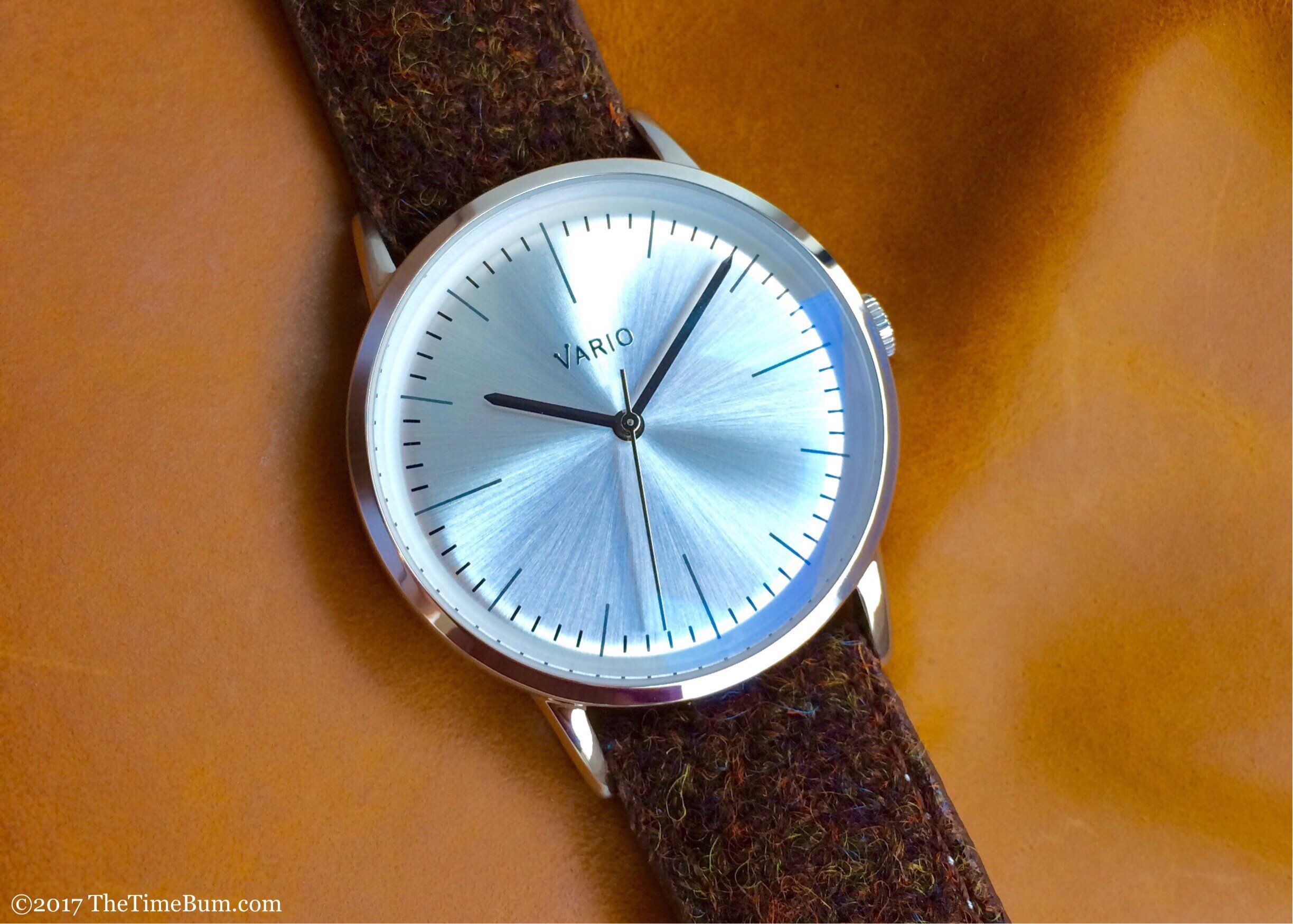
Our First Hands On Review by The Time Bum

"The sunray effect is stunning and more than makes up for the familiarity of the baton hands and markers. The Vario logo is novel, properly sized, and silver on this silver dial, which makes for a nice effect with the polished handset. Its fine lined markers are printed in black. Overall, it is a clean, effective design." -The Time Bum
Read more
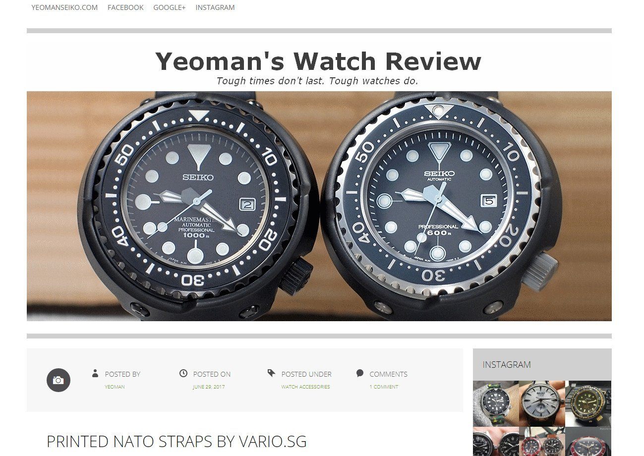
Vario's Graphic Strap Review by Yeoman's Watch Review
"These straps are comfortable to wear and are of reasonable quality. I see that a lot of thoughts have gone into some of the designs, particularly the Camo Green and Escher Crates. I consider them...
Read more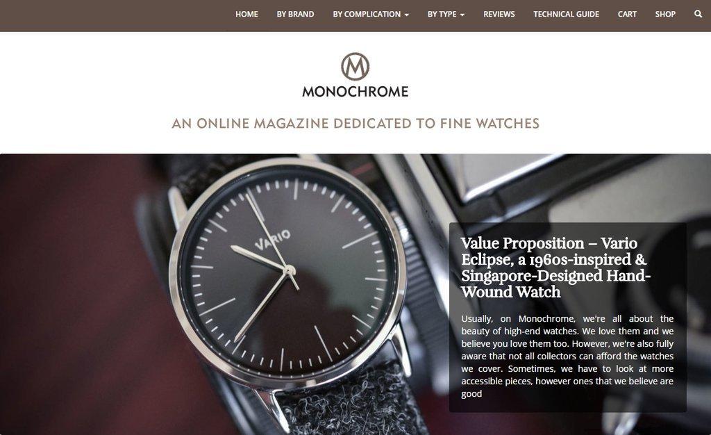
Vario's Eclipse watch reviewed on Monochrome Watches
"All the dials feature a subtle sun-ray brushed pattern, offering nice reflection and texture. Also, the dial is curved on the periphery (very 1960s-inspired) adding a lot to the way the watch ref...
Read more
Leave a comment
This site is protected by hCaptcha and the hCaptcha Privacy Policy and Terms of Service apply.